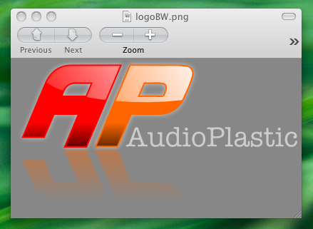
Using inkscape vector graphics to generate a website logo
This is a quick tutorial showing the steps required to generate a logo like the one seen at the top of this page. For this, I used the fantastic open source Inkscape software. In the past, I have tried to learn how to use various vector graphics drawing software packages, but have always run out of patience. This was until trying Inkscape. In comparison, Inkscape is easy to grasp and there is a large amount of user generated documentation online that will help you to produce amazing looking graphics in no time.
I am an inkscape beginner but thought it might be useful to produce a brief tutorial that combines some of the basic techniques that I’ve leant from other tutorials. I have noticed that many of the tutorials on the web do not take good advantage of the layers tools and so I hope to address this here. This tutorial was generated on a mac and so the screenshots have a mac look and feel. However, the commands outlined here should be identical on all platforms.
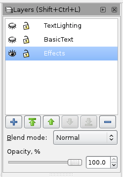
The first step is to open up the layers menu widget (Shift+… as shown) thing. I decided that I wanted some text with some lighting to make it look shiny and some special effects like a glow and a shadow. I decided to break this idea down into three layers as shown in the screenshot.
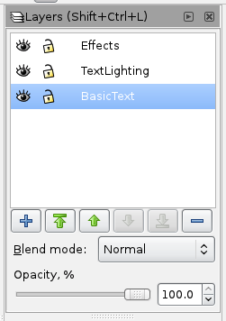
The next step was to create a basic logo using the text tool. Do this on the ‘BasicText’ layer. The ‘AP’ part of the logo used a non-standard font downloaded from a free font website. The colours of the text can be changed easily by highlighting a selection and then selecting one of the colours from the swatch at the bottom of the Inkscape window.

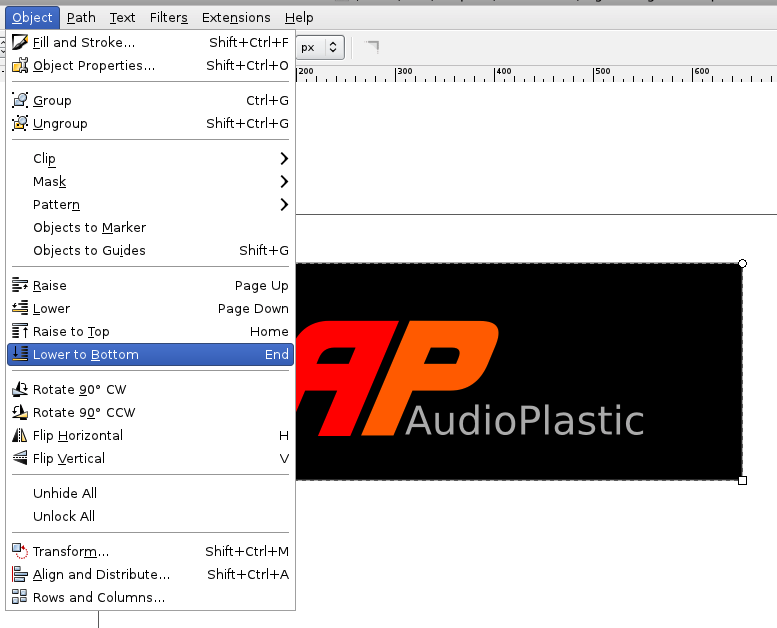
I wanted to check that the text was legible when using a black background. For this, I created a black rectangle and sent it too the back by using the item shown in the object dropdown menu. All looks good so I deleted the black box.
The next thing that I wanted to do was add lighting effects. I was only interested in doing this on the large text. The first thing to do was to duplicate the target text.
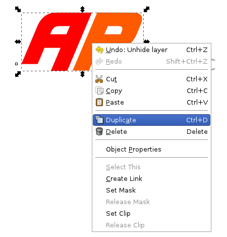
Once the duplicate was created, I moved the duplicate to it’s own layer that I reserved earlier for lighting effects.
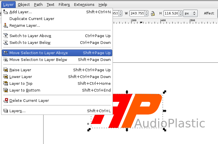
The visibility of each layer can be changed by clicking the eye image in the layers menu window. The fist job that I did with the duplicate was to create a gradient from black to transparent, from bottom to top. THis was to make the lower part of the text look as if it is in a relatively shaded region The gradient can be locked to the vertical plane by holding the ctrl key while dragging the gradient tool.
<img src=”/images/inkscape_logo_tut/Screen shot 2011-07-02 at 08.24.46.png” width=100%>
The next idea was to make the top of the text look shiny, like light is coming from above. For this, another duplicate was made and pushed into the lighting layer. I coloured it grey for better visibility. I then put an elipse on top of this duplicate.
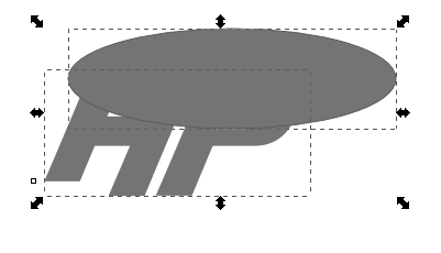
The elipse and duplicated text were both selected and the intersection tool in the path menu was then used.
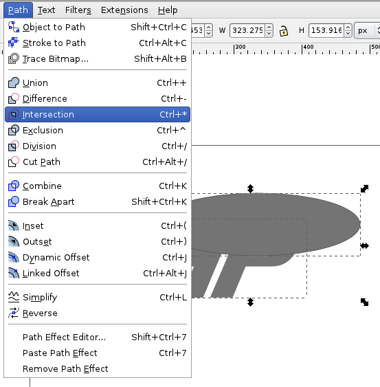
This does what it says on the tin.
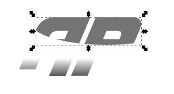
Setting the basic text layer to visible under this gives the following.

The colour of the inset was changed from grey to white and then a gradient was applied to transparent, adding to the shiny look.
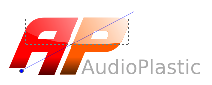
To give the edge of the text more colour definition, an inset was added like so.
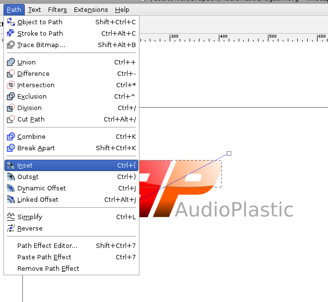
To give the following result.

Looking good! I wanted to give the coloured text a neon glow, so I duplicated the basic text once more and pushed it into the effects layer.
I then used the blur tool from the colours window to get the glow effect.
<img src=”/images/inkscape_logo_tut/Screen shot 2011-07-02 at 08.36.02.png” width=100%>
The layers can all be set to visible once again to see the combined effect.

I again wanted to test the legibility of the text on a dark background after making the lighting and glow modifications. However, instead of just drawing a rectangle and sending it to the bottom of the layer, I created a new later called ‘Alternative Background’, moved that layer to the bottom and then placed the black background within it. This makes switching the background on and off using the layers menu very easy.
<img src=”/images/inkscape_logo_tut/Screen shot 2011-07-02 at 08.40.12.png” width=100%>
In doing this, I noticed that the bottom, shaded part of the text did not contrast well against the background. To rectify this, I went tot the lighting layer and added an inset to the shading.
<img src=”/images/inkscape_logo_tut/Screen shot 2011-07-02 at 08.41.21.png” width=100%>
The resulting image after this transform is much sharper to the eye.

After this, I wanted to create a reflection in the horizontal axis, making the logo appear as if it is hovering above a reflective surface. For this, I created a duplicate of everything, copied it into an new reflection layer, and then flipped the duplicate upside down using the button in the top-left of the following screen shot.
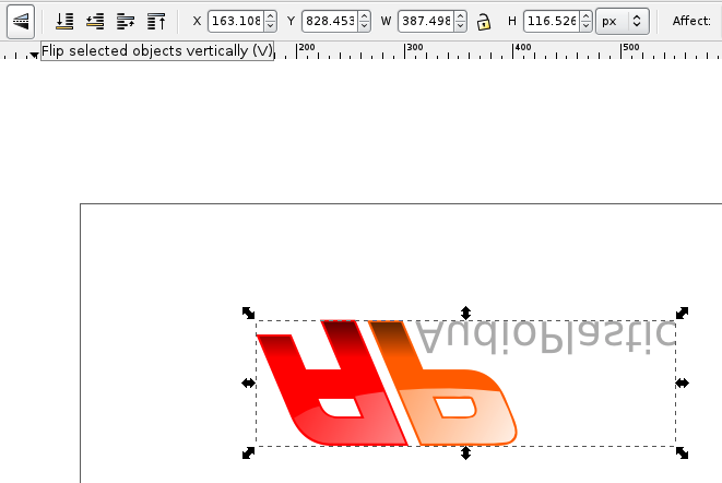
The duplicate was then moved below the original. Holding the ctrl key while dragging only allows the object to move in one dimension, thus making alignment simple.

Colour and transparency were modified.

Glow colour, glow amount and other subtle changes were made

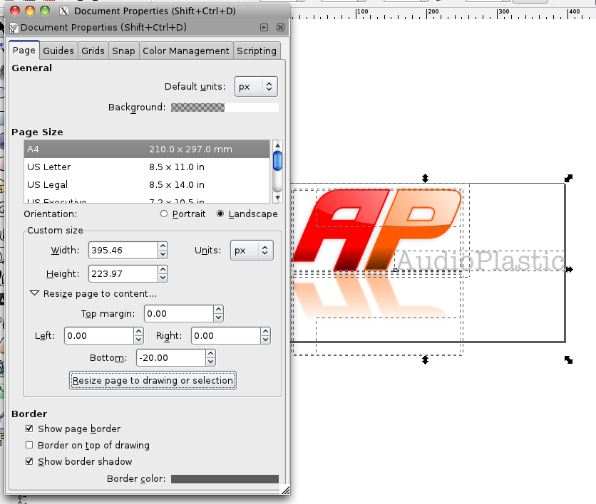
The final image was then ready for export. The first stage in this action was to resize the canvas. In the image properties box, there is a useful too to resize the canvas to mathc the size of the current selection. Seeing as nearly half the selection was transparent in the example shown, the lower margin was tapered in by some pixels
To export the logo in a useful format such as png, use the “export to bitmap” option in the file menu. the first time that I attempted this action, I used the “save as” option to save the image as a png. However, in doing this, I lost all of the alpha information and so the transparency was all messed up. The “export to bitmap” method gives predictable results.

The final png is shown in the operating system preview pane.
